My Pages

Saturday, 28 April 2012

Evaluation

After completing my film it is important that I reflect back on the process and why I made certain decisions. I have created an evaluation as an interview and also go into more detail here on my blog.


Question 1: In what ways does your media product use, develop or challenge forms and conventions of real media products?

Goodwins Theory

One important theory to look at is Goodwin's theory in which there are 8 main characteristics that music videos must follow. I have tried to achieve most if not all of these:

1. Links between lyrics and visuals
There aren't too many lyrics but the key one being "your face", is shown by lots of close ups of reaction shots and also a focus on the mask and the lack of a face. 

2. Links between music and visuals
There are certain parts where the editing fits with the music and by using fast editing this compliments the fast paced beat of the song and helps to blend in with the song. 

3. Genre Characteristics
I have discussed these in the evaluation film.

4. Intertextual references
There are various different dance moves which all have different origins with different genres. For example the "dubasauraus rex" has become iconic of the dubstep genre and also references to the gonzo skank made famous by Tempa T (grime MC from London)

5. Notions of looking 
Lots of point of view shots throughout the film that give the impression of someone watching them. 

6. Voyeurism 
When the main protagonist is putting on his mask we can see him looking into a mirror and there is a sense that someone else is watching him. 

7. Demands of the record label
There are a lot of shots of the artist and so will be promoting the pair and the logo, along with the song. 

8. Performance based
The music video contains a large performance element. 

Vladimir Propps Theory


  • The Hero – The two main protagonists 
  • The Villain – 
  • The Donor – Two backstage members
  • The Dispatcher – Will (Manager)
  • The False Hero – Cleaner
  • The Helper – Will (Manager)
  • The Princess – 
  • Her Father – Cleaner 
When analysing a music video it is often difficult to introduce this many characters at once and so this could lead to many characters having different roles, or just some roles not being fulfilled at all. 

Todorov's Theory


Todorov's theory states that each narrative will have 5 stages and that they will progress through these stages throughout the film/video. 
  1. A state of equilibrium - They are just sitting in the studio making music.
  2. A disruption of the equilibrium - The manager texts them and informs them about their gig tonight.
  3. A recognition that there has been a disruption - the pair look at each other in shock slowly realising their mistake. 
  4. An attempt to repair the disruption - they race down to the venue and play the gig in the end. 
  5. A reinstatement of the equilibrium - they finish the gig and then they can return back to their home to continue editing. 

 Use of software and technology


Below are some screen shots of the different software and how I used each: 
Premiere Pro was used to edit my music video.


One problem was the large rendering times impeding my progress.


Allowed me to use many different tracks to have flexibility.

Using the glow tool in Photoshop to finalize the back cover.

Using Photoshop to create my digipack.


Using Photoshop to create my advert.

I was also able to produce my animatic using Premiere Pro.

Wednesday, 4 April 2012

My Final Film

I have now completed my music video and can be viewed below:


Tuesday, 21 February 2012

Magazine Advert

After receiving the feedback that I had for the front cover of the digipack, I wanted to continue the mask theme throughout the video, digipack and poster. Looking at the research I saw that often many adverts in magazines are quite simple and so I decided to keep my poster simple and use a single image of the mask. 

However, I had to choose from several photos as I had taken many to give me the flexibility to choose the best one. I narrowed it down to four of the best ones which could potentially be used in the final poster which were all slightly different. 

Image 1
Image 2


Image 4
Image 3


After talking to other people about their opinion it was considered that image 2 would probably be the best as it looked like it was blending into the shadows and also looked good on the background. Others were considered too bright or that the lighting wasn't good enough to put on a poster. After I had decided on which image I was going to use I then imported it into Photoshop. I decided that perhaps due to the lighting being slightly uneven I would fix that and then centralise the image and have it as the main feature. From my research I designed a bright logo and then placed it on the top being the main focus of the poster and also being the first thing the audience would read using the Z pattern. I experimented with different fonts and finally chose "Coalition" for the Feel Good title because it was fitting that it was slightly faded into the background again complimenting the mask. Also it seems quite mysterious which, along with the mask, may create enigma codes that make people want to find out more about the song/artist.

Editing the advert in Photoshop
After adding the relevant logos and the information at the bottom I was able to finish my advert. The results of the feedback showed that people like the way it was the same image as the digipack because this is often a way of linking the two texts together to make it easier for the consumer to recognise the CD. Many posters which don't use the same image actually embed the CD's front cover somewhere else on the poster for this very reason and so it is a lot easier to use the same image. 

Final Advert Design

Tuesday, 14 February 2012

Magazine Advert Research

After conducting my research into the Digipacks I then needed to move on and research the adverts that accompany digipacks. Looking at lots of different examples one of the main themes that becomes evident is that they are often very simple and do not want to confuse the audience with lots of text but instead just show the album cover and necessary information.

One of the reasons that they concentrate on what the album looks like is because it is an advert and therefore impossible to listen to the album, persuasion is needed to ensure people who wouldn't usually buy it do so. However, most people will often be happy to buy an album but simply do not know about it. This is the main reason that print adverts are used - to inform the reader that there is an album.

This therefore explains the simplicity, often using shots of the artist and places where you can get further information if you want to find out more. The fact that the album cover is often the same as the poster helps the audience to know what the album looks like and makes it easier for them to recognize if they have already seen it before.

Below are a few examples which use these common factors:

Magazine advert for Cee Lo Green's Lady Killer Album
The album front cover for Cee Lo Greens Lady Killer Album

Looking at the two we can see that it does abide by the characteristics we have identified. It is a simple but effective title and shows the artist making it obvious who the disc is of, and also it allows the audience to link the name and the face together if they hadn't already realised. We can see straight away that the image is exactly the same and that the text has just been altered slightly. This demonstrates the fact that most posters use the same image as the digipack because then they can both compliment each other.

Another example which is extremely similar is Jessie J's album, Who You Are.

Magazine advert for Jessie J's Who You Are Album

CD cover for Jessie J's Who You Are Album
In conclusion there are several common themes which most posters abide by: 
  1. There is some sort of link between the poster and the digipack - often use the same image. 
  2. Keep it simple
  3. Sticks to a colour scheme
  4. Little Text - only bare necessities
  5. Lots of the artist

Tuesday, 7 February 2012

Digipack

After conducting my research into Digipacks I started to produce my front cover. I decided to initially use the mask as the theme as it was designed to be iconic and frequently seen in the video. Also I ensured that the audience concentrated on the mask by showing the shot of the main protagonist putting it on and then using it. I decided to take the picture with a low level of lighting to attempt to create a certain amount of mystery and also to allow it to blend in and ensure that the yellow stood out. 

I decided that I wanted to make the cover to be as good as possible but in doing so I wanted to get feedback to ensure that my views were echoed by others. I therefore constructed a brief quiz on SurveyMonkey and created 5 different mock ups of the front cover. All included the same image however they had all been changed slightly. 

Design 1
"Like it, it looks like the mask is coming towards you."
"Like the way its not very bright - very effective!"
"I like the font on black background."

Design 2
"I like the concept but it is a bit dark"
"Can barely see it"
"Maybe make it brighter"

Design 3
"I can't see its the mask anymore"
"The paint isn't very accurate"
"It's not the same colour"
Design 4
"I like it, it makes the text stand out"
"Might be too dark"
"Blends in with the background too much"

Design 5
"Similar to number 1, but I preferred it slanted"
"Like it, might look good on the poster"
"Maybe use the whole mask"
One of the questions asked in my survey - Digipack 1 was most popular
After looking at the feedback it was obvious that they decided that design 1 was the best. I therefore put this through into my final digipack which can be viewed at the end of this post. After finishing the front cover I had to decide what to put on the inside spread. I decided that due to the fact that the dubstep and drum and bass industry is a niche genre it means that often the listeners do not know who the artists actually are or what they look like.

Therefore I have incorporated images of the two main protagonists into the inside spread. After picking the two photos I then included their stage names and real names whilst still following the white, black, yellow theme which follows throughout the digipack. I then chose to turn the backgrounds black and white to focus more on the main protagonists and also included a yellow glow to compliment the yellow found on the front cover. After doing this I asked my audience if they liked it, which they did and so I kept the two images as they were.

Inside Cover Design


Inside Cover Design

For the back cover I decided to incorporate the use of the image which was used in the video and also in the digipack. I have created this link so that the audience knows that the two are the same and also it creates a link between the two that people can understand. I have used the idea of trying to embed the track list into the actual image, using the image of the roundabout, with an attempt to engage the reader. By changing each exit to a track name it could be mistaken for an actual sign until you look again. 

When I was asking my fellow peers about the back cover they said that they liked it however it didn't follow the yellow theme that seemed to be conveyed through the whole digipack. Obviously I have used the yellow for the text but they believed I needed more yellow and so I changed it and then sought feedback again. 

Design 1 for my back cover

Using photoshop I created a new layer which was just the sign and included an outer glow on the sign. I ensured that the colour was the same yellow used and then I asked my peers for feedback. They decided that this looked better, especially when put alongside the rest of the digipack and so I chose to keep it. 

Editing my back cover design to include yellow outer glow

After completing all 4 different parts I then had to put them together in the digipack format whilst ensuring that they all met the relevant specifications. I ended up by using a template of the digipack and then again using photoshop, imported the layers and moved them into the correct positions. Also I had to include a spine which I kept the same font as the front cover. 

Final Digipack Design

Thursday, 2 February 2012

Research Into Digipack


Skrillex - More Monsters and Sprites EP
This is the album artwork to Skrillex's third EP entitled "More Monsters and Sprites". A common theme that many dubstep artists include is a recognisable logo. Due to the fact that many dubstep producers are somewhat unknown they use logos to represent themselves in the media. Therefore we can see that Skrillex uses his logo (which is also the artists name) to not only ensure that the audience understand who he is but also the audience will be able to connect with this logo and relate it back to other songs and EP's he has created which will help to sell more of his records. He has used this logo on all his album covers so far and has changed each slightly so that it is different but still incorporates the same logo. For example below you can see the varying differences.


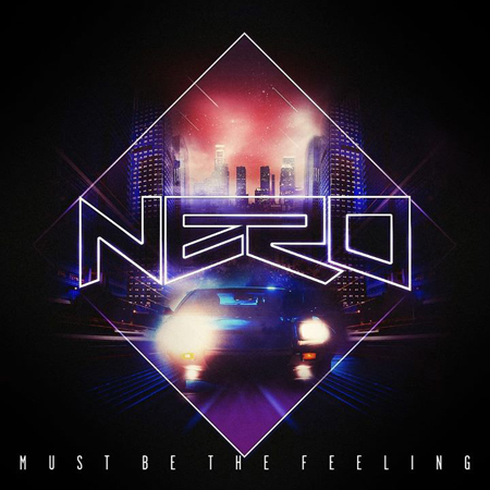
This can also be said for other artists, for example Nero. We can see also that they have adopted a very similar approach and even though the people behind the music are not actually well known, but the name "Nero" is becoming a very popular name in the industry. This has been helped by creating a strong identity for the trio and they now have a very recognisable logo and used it in all their singles and album.


Digipacks usually consist of one central image and a large logo for the artist or artists. Often there is very little other text so as not to detract from the song. As you can see above they only use the bare minimum text and keep it very simple. Mystery is also a common theme that seems to runs through (especially in dubstep digipacks) which encourages the audience to want to know more. 

The main content that was noted during my research was that the front cover often had the most important photo on the front cover and sometimes the back cover is a continuation of the front cover. Also there are often a lot of shots of the musicians. 

Colour schemes are extremely important when producing a digipack and many of the digipacks created nowadays have very bright colours in an attempt to differentiate themselves from other similar CD's. Also they like to use one colour and use it throughout the album which gives the artist and the CD an identity. It also is handy as it links the 4 different parts of the digipack.

Below is an example where we see that colour is used throughout the album:


Saturday, 14 January 2012

Animatic and Storyboard

To think about how my music video is going to pan out it is necessary for me to draw up a storyboard and create an animatic as it will allow a greater focus on what I want to produce when I come to produce the final product. Also it will be easier to follow and could potentially be used to explain to actors what I expect of them and give them a rough idea of the film before I start filming to allow them to fill that role.

My Animatic:


My Storyboard (Click to enlarge)


Friday, 6 January 2012

Equipment List

This is a list of the equipment which I plan to use in my music video:

Technical Items

  • Pioneer VDJ Decks
  • Numark Decks
  • Projector
  • Cyclorama Projector Cloth
  • Laptop
  • T Bar Stands
  • Smoke Machine
  • Strobe
  • Lasers
Other Props
  • Phone
  • iPod/iPhone
  • Headphones
  • Modestep Carnival Mask
  • Cleaning Outfit (Cleaners Polo)
  • Mop
  • Bucket
  • Modestep Posters

Saturday, 3 December 2011

Initial Idea

The main storyline behind it is that the main protagonist and the singer will be relaxing when they get a text telling them that they have a gig in Croydon. They then rush down there with all the equipment and set up and play the gig. At the end they find out that they aren't actually playing to anyone but enjoy it anyway.


To try and fulfil the conventions of typical dubstep videos I will need to have a live crowd. However, this will obviously be difficult and so to get around it I will still follow the conventions of live performance, however at the end of the video the house lights will be brought up and he will be playing to no one, symbolising the fact that everyone has to start somewhere and that eventually you can make it if you try. Also, it shows that despite this he is still having a good time and that sometimes music can just be all you need to have fun.


The way that I plan to add humour into the video is that when he looks into the crowd and sees that there is no one there, there can be a cleaner cleaning the floor. There is a breakdown section of the song which can be used as the two look at each other, but then it drops again and at this point the cleaner will start to dance and the DJ will carry on like usual. This will be quite humorous because he will be playing to one person at a gig, but he still doesn't care and carries on anyway.


I believe that due to my experience as a DJ I can produce a realistic visual experience that the audience will believe as a real gig. I have the equipment available to me and so it should be able to look very professional. It will need to be planned well, and I plan to do a detailed thorough shot by shot to ensure that I have the correct footage and that I have enough footage to produce the music video.


My one concern at the moment is that it will be likely to have fast cuts and edits between shots, and so for a 4 minute long video I will need quite a lot of footage. However, I think if I plan it correctly I will be able to record enough so that I can fill any gaps that may occur.

My Song Choice: Modestep - Feel Good

Modestep are a live dubstep band from London that initially formed in 2010. It is made up of Josh Friend, Tony Friend, Matthew Curtis and Nick Tsang. They are currently signed to Polydor and Interscope. Their debut single was called 'Feel Good' and was initially released in early January. It peaked at 38 on the UK charts and managed to get to 6 in the Dance charts. They have been supported by Radio 1 which has offered them much publicity and who have also in return done various live lounges. They are currently working on their album "Evolution Theory" which is set to be released in 2012. 

Song:
Name: Feel Good
Artist: Modestep
Writers: Josh Friend, Tony Friend, Matthew Curtis and Nick Tsang
Original Release Date: 7 Feb 2011
Label: UKF Music
Copyright: 2011 AEI Music


I chose this song because although it is still dubstep, it has vocals which can be performed alongside the DJ. This will mean that there can be a performance element to it as well. Also, I have listened to it quite a lot and so know the structure and the timings of the song well. This should help me to better visualise and plan the music video going forward. I have watched a lot of dubstep videos and so this was one of the reasons why I wanted to make a dubstep video because I already had prior experience meaning I could produce a video more fitting to the genre.